The Education Loan Process: Lengthy and Time-Consuming
Over 200,000-300,000 students in India apply for education loans, but the process is often tedious and time-consuming, requiring extensive document submission and verification from both the student and guarantor. But this manual process can be streamlined digitally, allowing applicants to apply and monitor their loan status efficiently.

Ugh, forms... Will this ever end?
Filling out forms on mobile can be tedious, so we needed to simplify the education loan application process by minimizing steps and the input fields.

"I'm unclear about the documents I need to provide, what Ria needs, and the required information—it feels like there are too many steps involved."
end goal
To ensure that both applicants (students) and co-applicants (parents/guardians) feel confident to apply for an education loan with ease on the mobile application.
Sneak Peak
Feature #1
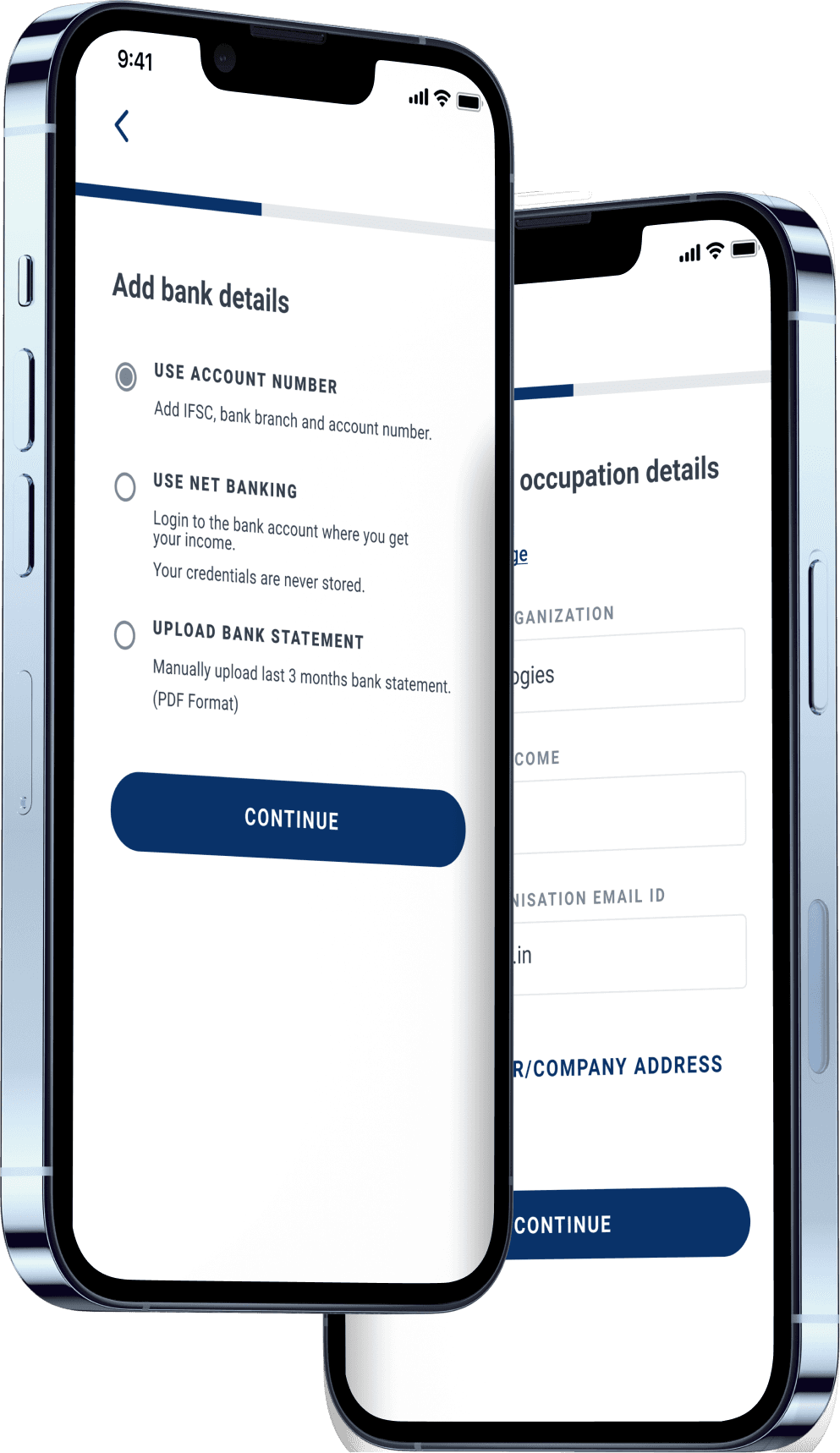
Automating Actions to minimize user effort for ID + address verification
To minimize manual input and errors on mobile screens, we introduced options for users to auto-fill their address via GPS and scan their ID using their phone’s camera, reducing the time to complete these steps from 10 minutes to less than 1 minute.
Feature #2
Visibility of form completion with specific milestones to motivate users
Previously, 300 users began the application process daily, with a 33% drop-off rate (100 users) due to the effort and time needed to complete the form.
With the new progress bar, celebratory cues, and reduced completion time (15 to 8 minutes), the drop-off rate is now estimated at 17% (50 users), as some may still opt for competitors which offer lower interest rates.
Feature #3
Chunking information to perceive it as a form with a lesser effort
We streamlined the application process by reducing 12 steps to 6, by chunking into similar categories, restructuring the information architecture, and adding an overview of all the steps on the homepage, estimating an increase of daily form submissions from 200 to 350.
Iterated on current application flow, updated information architecture to outline automations in ID, address and academic details


8/11 usability test participants for low-fi prototypes mentioned confusion about required vs. optional fields, information grouping, and remaining steps
We used sacrificial prototypes to understand which input fields could be ‘sacrificed’ and omitted as well as a brief card sorting exercise to understand which information chunking matches potential user mental model.
Visibility of milestone completion on progress bar to keep users motivated
We introduced features and cues such as celebrating milestone completion, reviewing steps and overview of steps remaining to motivate users to complete the application and provide a sense of completion.

Automating actions to minimize user effort for ID + address verification
Usability tests and a feature audit showed that users prefer scanning an ID over manual entry due to the effort involved. Also since typing has a high interaction cost in mobile screens, we prioritized automated actions over manual input in the information hierarchy.


Chunking information to perceive it as a form with a lesser effort
We chunked the long form [Hick’s law and Miller’s law] into 6 important steps to decrease in cognitive load and increase the completion rate by applicant and co-applicant. We also utilized sharing links and providing updates on the tasks dashboard to assist co-applicant to fill in details as well.

We projected 300,000+ sign-ups for the mobile education loan app, driven by India's growing smartphone user base and rising digital loan applications.
The estimated time to complete the form and approve the loan would decrease from 1-3 months to 2-3 weeks, because of breaking down the complex steps, and automating steps in the mobile application.
Understanding requirements of different stakeholders
Communicating with different stakeholders involved understanding what mattered to them. Managers wanted to understand ROI, while front-end developers needed to understand UI aspects to translate the design into code.
Limited points of reference
Many companies and banks in India have not yet integrated digital mediums into the loan application process. Hence testing with other experts was key here.
Considering expected input
When designing mobile forms, it's crucial to account for limited screen space, the touch area of fingers, how users view and scan information on smaller screens, and how to guide them in making quick decisions.